
In 100 Things Every Designer Needs to Know About People Susan Weinschenk talks about the role peripheral vision plays when users interact with websites. According to research performed in 2009 by Dimitri Bayle human beings often react more than twice as fast to sensory input in their peripheral vision than their central vision — especially if the sensory input is that of something moving or a possible threat.
So how does that translate to UX?
Well the basic take-away is that UX designers should avoid displaying any moving objects not related to a users current task otherwise the user will feel uncomfortable and find it difficult to concentrate on the task at hand. An example of the inverse of this is in Mac OS and Windows you’ll notice that when a program wants your attention its icon in the taskbar or dock will flash or jump at you repeatedly and attempt to steal your attention from whatever it is you’re doing at the current moment. It’s incredibly hard to ignore even if you actively try to blank it out. Substitute the movement for a simple solid colour and it’s much easier to ignore.
Let’s take a look at home pages of some of the most popular sites and see how they use peripheral vision to engage or distract users.
Airbnb
Airbnb’s homepage spends a lot of real-estate promoting its concept in a busy video full of case studies however even after the user focuses on the form the video keeps playing which, coupled with the calendar scrolling into view, creates a pretty distracting experience for the user.
Verdict: Airbnb should pause and dim the video on form focus to avoid peripheral vision fatigue.
TripAdvisor
TripAdvisor uses a similar design to Airbnb however the hero image doesn’t contain any motion. On top of that, as you can see in the above video, when the search inputs are focussed the hero image is slightly tinted to reduce peripheral distraction and emphasise that the user has entered a task state.
Verdict: TripAdvisor does a good job of minimising peripheral distraction and encouraging focus on the search task.
easyJet
The easyJet homepage is a total classic — it uses a carousel to alternate between hero images with captions promoting different specials. However as you can see in the above video, even after the user begins the task of searching for their flight the carousel continues to move between the slides. This might even be more distracting than Airbnb’s home page as the slides change unexpectedly which may cause the user to think their interactions were responsible for the animation.
Verdict: easyJet should pause their home page slideshow when the user enters the search task in order to minimise peripheral distraction.
Skyscanner
Skyscanner contains an animated advertisement on the home page next to search box. When the search task is initiated no effort is made to cover or hide the advertisement. It’s distracting but understandable considering the revenue model of Skyscanner’s business.
Verdict: If it’s not going to cost them crazy amounts of money, Skyscanner should contemplate covering or, if possible, pausing the advertisement next to the search area once the search task is initiated.
Conclusion
Tripadvisor does a great job of providing a high impact home page whilst not distracting users from the obvious search task. The other websites are seduced by the allure of using the home page for internally marketing and advertising in ways that distract the user from the task they’re meant to perform.
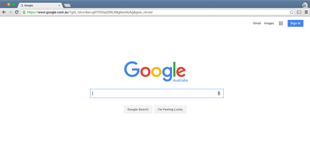
Don’t forget, all of the home page designs shown above are designed primarily to get users to execute a search. If you don’t think that peripheral distraction is really an issue look at the most successful search engine of all time — it definitely follows the rule of minimal peripheral distraction:
Peripheral vision in digital travel design was originally published in UsableTravel on Medium, where people are continuing the conversation by highlighting and responding to this story.