
It was early 2016 and I was sitting at my desk in Melbourne’s Inspire9 co-working space in a corner that Rome2rio peacefully occupies. In front of me were printed out screenshots of the existing Rome2rio flight booking user interface. We all knew that the user experience sucked, what we didn’t know is what direction we needed to go in to fix it. On top of that concept-to-development would have to be fast to keep with the Rome2rio ethos of experimenting in the wild rather than in the lab. This was going to be a challenge…
We all knew that the user experience sucked, what we didn’t know is what direction we needed to go in to fix it. On top of that concept-to-development would have to be fast to keep with the Rome2rio ethos of experimenting in the wild rather than in the lab. This was going to be a challenge …
Crafternoon!
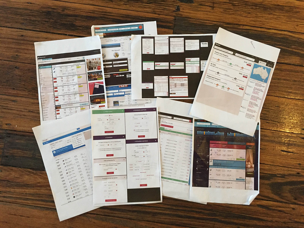
The travel industry is huge, pulling in $341 Billion dollars in the US alone in 2015 and growing by the year. I was sure that all the top companies had A/B tested their booking flows to the limit — it was time to do some research. I collected screenshots from some of the leading travel websites on the Internet and printed them out. These would be my reference, something to continuously look back on throughout the entire process, something to benchmark my ideas against. I laid out the printed screenshots, organised a meeting with the rest of the front-end team and so it began …
Flight tickets — the similarities and the differences
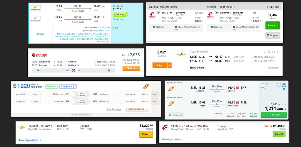
Step 1 was isolating the tickets used on 8 big name flight booking sites and attempting to find similarities and differences.
Ticket summaries and green buttons
Six of the 8 tickets contained summary columns on the right hand side, each ticket contained a button with either a green button or a button in the brands colour. I was on to something! Green buttons can’t just be a coincidence, especially when nothing else on the page, or in the brand, is the same green. Why would a company go out of their way to create a unique colour to be used solely for a single call-to-action?
Note: Colour is complex from a cultural point of view. You can check out http://www.informationisbeautiful.net/visualizations/colours-in-cultures/ to get a better idea of what different colours mean to different cultures. Green is, however, a worldwide UNIVERSAL colour for ‘GO’ in traffic lights. You can read all about it at http://www.todayifoundout.com/index.php/2012/03/the-origin-of-the-green-yellow-and-red-color-scheme-for-traffic-lights/
Another feature of the summary columns was per ticket prices. The search on all sites was for 3 adult passengers yet only GoEuro displayed the price for the entire order, all the other sites displayed the per ticket price. If users were going to be comparing Rome2rio’s ticket prices to other flight search websites we were going to need to display tickets in the same per-passenger format.
Journeys
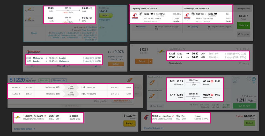
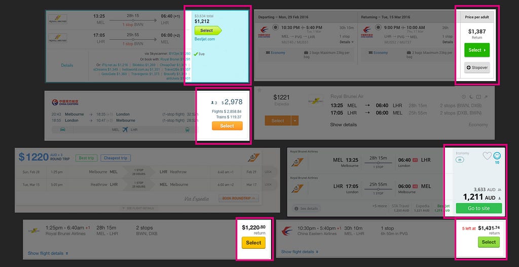
Outbound and return journeys were presented as rows, the exception being Webjet who presented them in columns. This layout would make it easy to present one-way and return tickets using the same design without creating awkward white space. It is however easier to scan a large list of tickets if the journeys are presented in column format so this was a real-estate vs convenience challenge — one which we may re-visit in the future.
Another similarity we found was the use of +1/+2 after times which occurred on a following day, common for long distance flights that span timezones. We’ve talked about other ways we could present users the date of their arrival if it’s different to their date of departure however this research seemed to reinforce a standard, one that we’d be brave to deviate from.
It’s all in the details
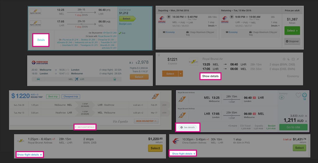
Another thing I quickly noticed is that what was presented on the ticket result wasn’t the full story. All but Webjet and GoEuro used the term ‘details’ in their call to action to view more information about the ticket. The wording and method of progressive disclosure was consistent. The call to action was always located at the bottom edge of the ticket result and mainly towards left side — as far away from the main call to action as possible … I wonder why?
“The brain can only process small amount of information at a time — consciously, that is. (The estimate is that you handle 40 billion pieces of information every second, but only 40 of those make it to your conscious brain.) One mistake that designers sometimes make is giving too much information all at once… Progressive disclosure means providing only the information people need at the moment.”
- 100 Things Every Designer Needs To Know About People by Susan M. Weinschenk Ph.D.
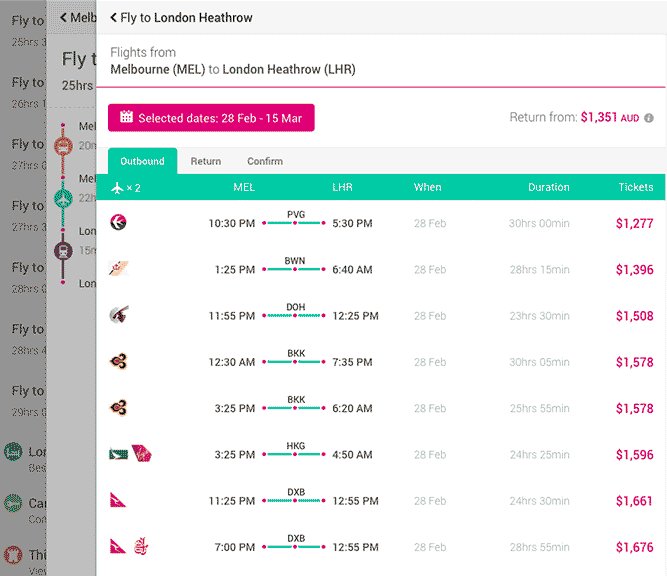
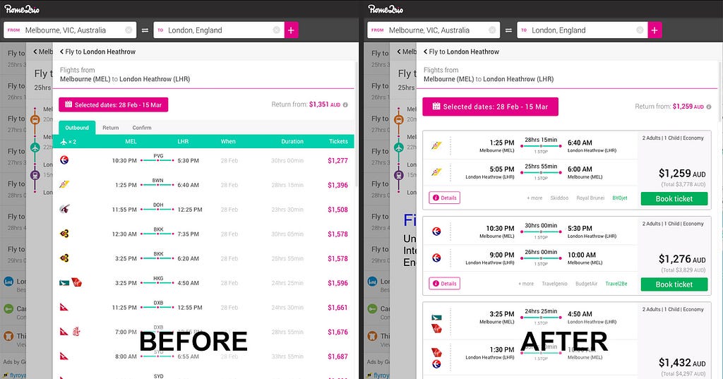
Rome2rio’s new ticket design
Armed with detailed knowledge about what users expect from a ticket design I got to the task of designing and building a concept for the Rome2rio ticket. After about a week of sweating the details I came up with a candidate to test in the wild…
Our split testing method
At Rome2rio we split test almost everything even if we really believe in a feature or improvement. Some of the benefits to split testing everything are:
- Gives us a deep understanding of just how much impact a change we make has.
- Allows us to quickly turn off a new feature or improvement if something went wrong.
- Forces us to develop code that’s more decoupled, more flexible, and better designed.
We ran the experiment on English, desktop users to begin with — and out of that we picked 20% to be our experiment recipients. It was a fairly small sample size of our entire user base however it was big enough to get us accurate results whilst still insuring us against the possibility of failure.
So the results?
Users were 61.5% more likely to make it through the booking process with the new flow.
Admittedly this was an easy win project as the old design was in serious need of an upgrade however it’s incredibly rare to get this kind of increase overnight on a high value part of the product. We graduated the experiment to 100%, ported the design to desktop, removed the legacy code and eventually submitted the new strings for translation.
Even though this was a clear win there was still some digging to be done. We took a deeper look into which Google analytics events were being fired off and found something interesting …
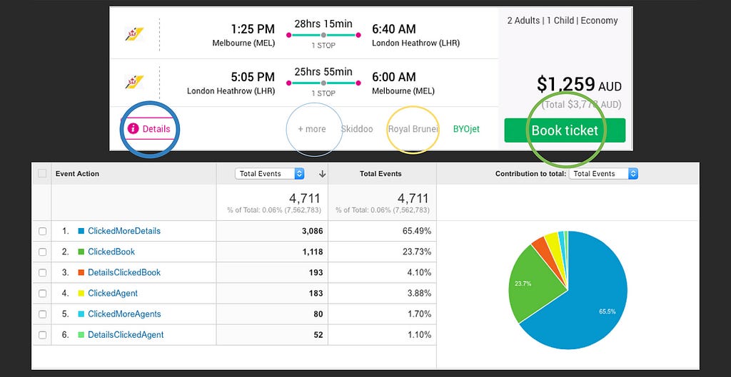
The Details button was being clicked almost 3 times as much as our main book CTA! From a design point of view this didn’t make sense because more details was smaller, in the corner, out of the way. Worse than that only 6% of users who activated the details popup went on to book a ticket from the popup (DetailsClickedBook event). This figure hasn’t really changed much however there are a few ways we can account for it. Some users are just there to research, not book, and are more likely to get as much information as they can to take elsewhere to book their flight. Maybe we’re not presenting enough information, however from user testing session we’ve performed we haven’t had any feedback that would suggest that. The jury’s still out — let us know what details you think are missing.
The journey has just started
It’s true that you can only get so far by taking inspiration from others however in many situations doing so gets you to a great starting point. Going through this research and development process wasn’t about getting us to an end goal, it was about creating a solid, well-researched foundation for future experimentation. I’ll soon be posting some more articles about future enhancements we’ve since made and the results they’ve had to our booking counts. Until then feel free to check out the work we’ve done and make any suggestions on how we can improve the flight search experience!
Revamping the Rome2rio flight booking user experience was originally published in UsableTravel on Medium, where people are continuing the conversation by highlighting and responding to this story.