
I’ve just spotted Skyscanner running experiments on their booking ticket select buttons:
Button states
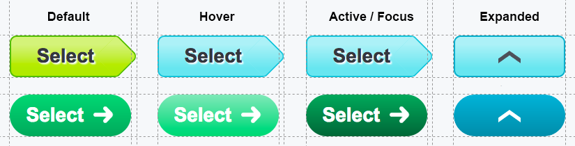
The new pill shape design now has an active state and has a more subtle hover effect. What’s interesting is that the old hover effect was Skyscanner’s brand colour whereas the new hover effect is a variant of the booking-green they are using. If this feels like de-ja-vu it’s because I’ve made reference to green booking buttons before at https://usabletravel.com/revamping-the-rome2rio-flight-booking-user-experience-c0cdacfbfc8b#4adb.
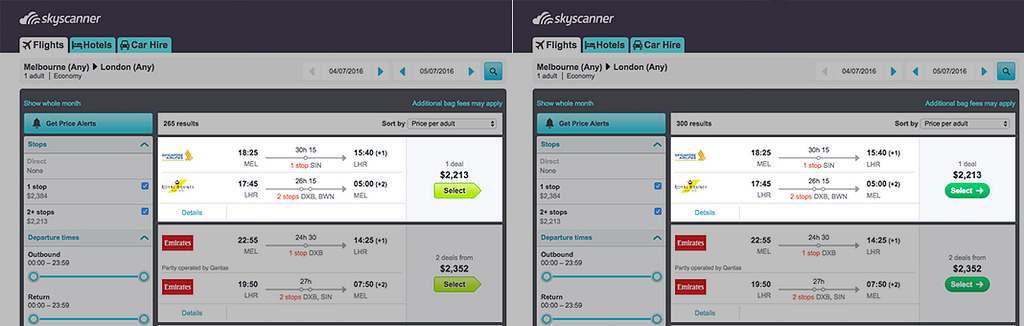
Tickets
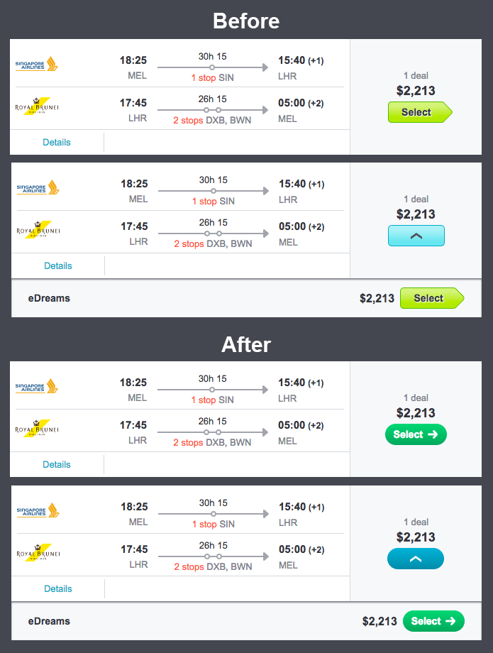
Everything else about the ticket result layout remains unchanged so it’s clear that the experiment is only focussed on buttons and nothing else.
Looking forward to see which design sticks.
Experiment Watch: Skyscanner buttons was originally published in UsableTravel on Medium, where people are continuing the conversation by highlighting and responding to this story.