
Flight metasearch websites like Skyscanner, Momondo, and Kayak search a variety of online travel agents in real-time to get the cheapest tickets for a given route. When results aren’t cached they take a lot of time to load, an age in internet terms.
Tonight I ran 3 spaced-apart tests with a route from Melbourne to London departing on the 15th of September and returning on the 22nd of September on Skyscanner, Momondo, and Kayak. The cheapest result for all three sites was the same but the time it took varied. There are two metrics I measured, one was time-to-first-result and the other was time-to-finish. and
Benchmarking
Time-to-first-result
Time-to-first-result was how long it took for the first result to be displayed after clicking the search button. Skyscanner won this round with a very speedy average of 3.6 seconds, whilst Kayak lagged behind with 5.5 seconds and Momondo finally with 6.2 seconds.
Time-to-finish
Time-to-finish was the entire time it took to find all the cheapest prices available. Kayak took the crown with 16.26 seconds, much faster than Momondo’s 34-second average and Skyscanner’s 31.4-second average.
Ten years ago if it took 20 seconds for a Web site to load, we didn’t think much of it. But these days if it takes more than 3 seconds you get impatient
- Susan Weinschenk (100 Things Every Designer Needs To Know About People)
Progress indication
34 seconds is a long time to keep a user waiting! The thought and care that goes into how progress indication is shown to end-users on these sites is far beyond the norm. Here are screenshots that show the flow of progress indication on each of the three sites:
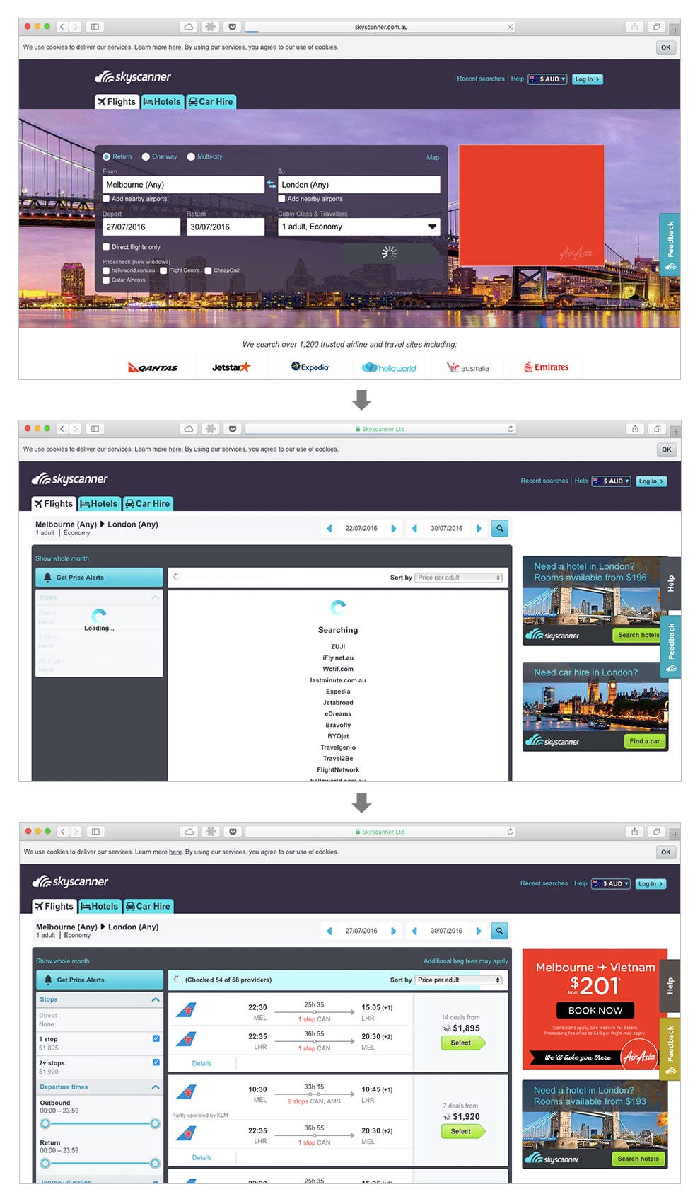
Skyscanner
Skyscanner’s user interface may seem a bit outdated compared to its competitors but the user experience when it comes to progress indication is easily the best. The spinners on the prices function as a great reminder for users to wait to allow prices to finish loading — something that none of the other sites do.
Momondo
Momondo’s UI is the most beautiful of the three. The giant spinner on the left shrinks once Momondo has determined there are enough results to get probably the cheapest flight.
![]()
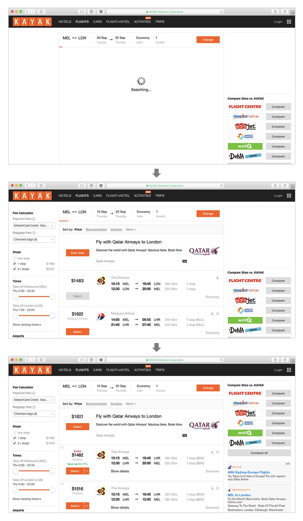
Kayak
Kayak are very minimalist when it comes to their progress indication. As soon as they have a set of results they reduce it to a small line below the search terms which is easy for users to miss. The issue with this is that users may select a flight before all the results and prices have fully finished loading and there’s no strong motivation being provided for the user to wait.
Dark UX?
So is there dark UX happening in Kayak’s example? Are they hiding that fact that the cheapest price might not be loaded yet from the user? Kayak were the fastest of the three so they can get away with it but it’s definitely in a grey area. Skyscanner had by far the best user experience by putting a loading spinner next to each of the prices urging users to wait until the final price was updated. I’m not saying it’s pretty, it definitely isn’t, but Skyscanner wins the progress indicator competition from a user experience viewpoint. Momondo, as always wins the most beautiful category.
Progress indication on flight metasearch websites was originally published in UsableTravel on Medium, where people are continuing the conversation by highlighting and responding to this story.